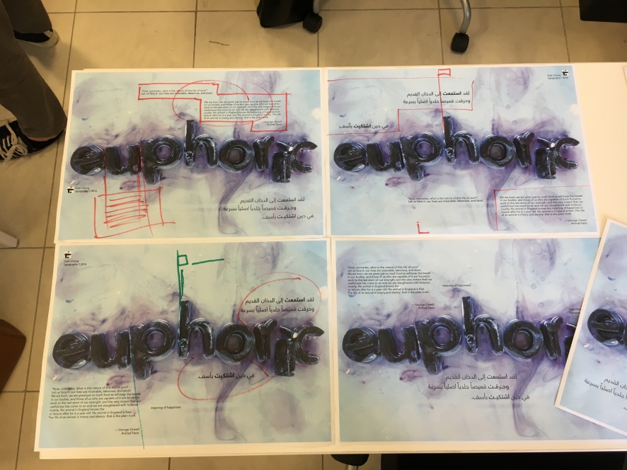
Second attempt to put the poster together


These were my second attempt, with a better understanding of alignment. Understanding this, it was much easier to work around on the composition of the six elements. They looked much more thought out than the first experiments i did. The top right sentence was working quite well with the break up of the paragraph as well as the ghost box. The box made the paragraph as if it was floating in the water. I had struggles creating the ghost box since my photo was RBG and apparently my indesign setting was on CMYK so it kept making the photo go a grey-ish tone but i was able to figure it out online! (thanks google). However i wasn’t satisfied with the sentence composition on these and i didn’t like the sentence with the ghost box. It made it look too isolated from the image and since the sentence was quite short and in a bigger font it looked quite boxy and out of place. Playing with the square inspired by Majid Abbasi, from the suggestion from class it looked much more interesting and in harmony than when i placed them in the corners. It almost activated the y axis on the page. Personally i think it worked best when it was at the bottom than the top because of the paragraph composition.
Third attempt
With knowing what i wanted for everything else, i started to play around with the sentence. For most part i changed such little like having the same sentence structure, just changing the axis alignment. I made a lot of little changes and here are a few top picks


From these i chose the two on the right because the top left looked like the sentence was too crammed together and the bottom left was arabic, left justified which could be a problem for arabic readers. I had a hard time choosing between the two on the right because they had their goods and bads.
I liked the top right because i felt like the sentence flowed with the background, it looked like the setence was a part of the back, floating together and it activated the whole poster. However it kind of looked like a diagonal composition which could be too boring and it felt like i was trying to fill up the whole poster.
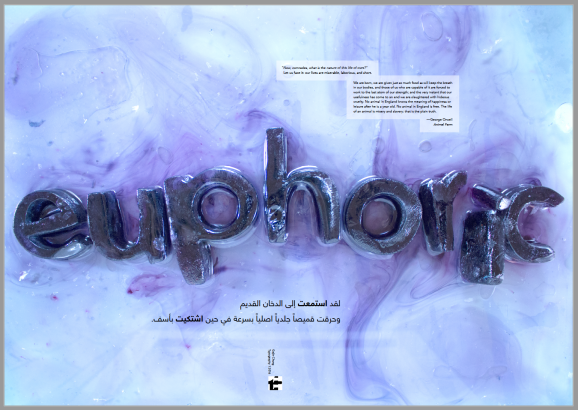
i liked the bottom right because the sentence made the whole thing unite(?) together everything was floating around “euphoric” it almost had a cycle that the other elements lead the eye to the word again. Though it may look a little clustered there was something about it that didnt make it look too clustered? There was enough breathing space around all the elements and the “empty” spaces didnt look very empty because the eye was focused to the middle. However that could be a bad thing because the eye wasnt moving around the whole poster as much and i felt like was that okay? and was my cluster thought wrong? was it clustered?
In the end i took a risk and chose the bottom right because, though it may not activate the full page, making the eye move around. I felt like to me at-least it looked visually more interesting than the other one and my reason why i liked it seemed stronger for this one than the other. I don’t know if i made the right choice but i believe i did and if i didn’t… i hope my reason was negotiate-able(?) lol

For the final critique all i got was “done” but in my head, i was still debating whether if this was better or the other. But i decided to stay strong with my previous choice.
Final reflection
because i had experience playing with sentence and paragraph from the previous projects, the process was much smoother hence why i don’t have as much process. But playing with type on a blank page and on an image was a different experience. I had to think about how i might break up the sentence and paragraph according to what i had on the image. Because i had so much space to play around with it was quite hard, i had no limitation of space, i could really use it however i wanted to. Some might be jealous but this was personally hard for me too because there were millions of different solutions. So the tedious work started again where i made millions of experiments playing with the whole space, changing little details that to me, mattered a lot, surprisingly. Working on this made me realize how much moving the same sentence in a few centimeters could change the overall visual appearance.